


-Filming:
To make our video a success we need to add various propps, costumes and different locations.
We have made various lists of what we are going to be using within our video to make it look unique and stand out above the rest here are the key features we are thinking of using.
Different characters that Taylor will play:
Weather Presenter
News Reader
Fashion Desinger
Baker
Celebrity
Painter.
Propps
Cassette player
Baking Equipment - Trays, ingredients, aprons, oven gloves.
Cleaning Equipment - Bottles of cleaning products, cloths.
Fashion Desinger - Manikin's, tape measure, clothing.
News Presenter - Laptop, various notes.
Celebrity - Car, Red carpet.
Painter - Paint brushes, Paint, Various card/paper.
Costumes
In the song there are references to being successful and independent. So we have come up with respectable ‘Job’ ideas for our artist such as;
• News Reader
• Weather Reporter
• Makeup Artist
• Teacher
• Celebrity (brings a comic element)
To contrast with these jobs we thought of jobs/situations that the artist would find unpleasant and would want to steer clear from;
• Cleaner
• Cook
• Walking through mud in willies
We also want a performance element into our video with the artist being surrounded by frames and netting.
We want to try and correlate the lyrics of the song as best we can with the visuals so this is why we have come up with a lot of interesting scenarios for our artist to portray.
- Canon MD235 Video Camera
- Lighting
- Photoshop Software
- Indesign Software
- Final Cut Express
- Green Screen
- Lumix 12 megapixels DC Vario - Elmarit Still Camera
- Photoshoot studio
- Tri-pod
- Apple Mac Computer
The gaps in the blog say it all - you still have a lot of research to do and you really should be at the planning stage. Kirsten, Taylor and Sarah - you all need to do much more.
You still need to work on the feedback comments given last time.
You have Sam's initial post on the conventions of music videos - then we have several that focus just on Rep and Ideol - why? They should explore how music videos work - do Goodwin's ideas about their conventions hold up? how do videos vary these ideas? what do you notice works well in the video you are focusing on? what could you use from this video? You need to retitle and refocus these entries or you are not really looking enough at how videos work; at present, you are just looking at one small feature (Rep) and not really tying it in to your projects - it's detached research and does not benefit your project much.
You have some posts looking at IndiePop Videos but I have the same issue with these - they look at general ideas about how the video works OR rep/ ideol. Again, these need refocusing. Why not insert a post looking at indie and pop genres - what are their key features as seen separately? (types of song, type of performance; colours; setting; costume - typical artists); then look at what happens when you create a hybrid or fusion and some artists that you think fit this fusion... Then, having done the general intro, go into the posts about indie-pop videos - how do they use and fuse their separate genre elements? what do we expect from this type of video?
Then, end this segment with a post, summing up what the implications of your research into this genre are for your video. This will give it much more impact and coherence and relevance. You can use some of what you have done but need to make quite bold changes.
Still need stuff on audience and institution - can Kirsten put her summary of audience research near to the questionnaire section and add a bit about it suggests you will have to bear in mind for your own product?
Sam - PP on Marina and the Diamonds - need to add comment on what it reveals/ what it implies for your product? Could sue it to show how an indie-op artist has branded herself - what elements create the quirky indie feel and how has she sustained this over her career? What can you learn of this for your artist?
Sam - Branding - part of this is about creating a distinct image (USP) that appeals to the right audience. You could add this in and then incorporate your study of Marina's image in here?
Sam - Lady gaga branding post - focus is a bit confused - you start by analysing the conventions of a CD/digipak cover...which would fit better later on in digipak post. It then merges into an analysis of Gaga's branding - better to label it as such and keep this bit here , as a follow-up to the branding work you have done OR adding it into the branding post, as an example of how branding is consistent over a range of products and why....
You must work to get this up-to-scratch asap - you should be well into your planning by now...

These two magazine adverts featuring two similar music genres, are showing the typical advertisments of two different artists in similar contents.
Firstly the advert which was placed in the popular magazine Q advertising Gwen Stefani's new album at that particular time focuses mainly on image and font to create this representation of good song writing, attracting the audiences eye, keeping them engaged by the contents we see feautured to the left hand side. The first aspect that reflects this is the main focus being the huge close up picture of the artist herself showing that this advertisment is all about her and when reading this magazine, being a commited fan of this artist or having interests within her, will automatically make you read in depth to find out what this advertisment is actually advertising making buyers available.
Colour is often used to also attract attention mainly having the golden and red contrasting to create a bright, appealing attraction towards its audience making the poster reflect more towards the female teenagers. It's almost like a pastel image has been created which is something individual for the artist, a more alternative representation as usually a basic image would be used as the artist and more focus would be brought upon the font and props to give the overall poster a much more larger appeal for its audience.
The font used is a much more unquie one to advertise who the artist is who is featured as well as the different bits of information gathered underneath to add to the already knowledge given. This font has obviously been used as a way of once again appealing to the correct audience and wanting them to gain attraction into the advertisment by seeing the font that makes it stand out. The artist's name itself is featured in bold writing which is showing to the audience that this poser is focused on her, this is who it's advertising and who's merchandise they are selling. Underneath the bold heading, the albums name has been placed to tell them what the album is callled as this is an important piece of information for any poster advertising music albums, and by separating the individual words this also draws attention towards it as it is now more easily viewed.
As well as this they have added a few well known titles of two songs off the music album, which fans of the artist will already be aware of making them once again interest in the advertisment, interested in buying her album, keeping the main important information in bold letting and changing the font and to a smaller size for the less important points.
The second magazine advert is advertising Ellie Goulding as an artist who is playing at music venues, rather than an artist who is advertising one of her albums like Gwen Stefani.
What's similar to the first advertisment is that a huge close up has also been placed featuring the main artist, showing once again that this music poster is advistising Ellie Goulding, she also seems to have been placed as a 3d image making her stand out more, creating a more realistic image for its audience, as well as having the basic standard background.
The colours that have been used within this poster are mainly darker colours, focusing on blacks creating a representation of nightlife which is exactly when the artist would perform at such venues such as the underage festival shown in this particular photo, having the stage setting in the background reflecting that the person shown is an artist.
This music advert is kept very simple using simple fonts to create a bigger image/representation of the singer, making the poster mainly focus upon her and not different types of fonts surrounding the artist. The only colour used for the fonts is the white basically telling the audience key information about this particular picture, where the image was taken, who it was taken by and a website featured what you can visit in order to find out more information about this event that took place. Having the white font placed upon the black background gives a good image in itself, as it makes the font stand out above the rest attracting the appealing audience which in this particular case would be female teenagers to young adults.
This advert seems to mainly focus upon colour and the image of the artist itself to advertise Ellie Goulding the difference with the first one was that many bits of additional information in unique fonts and size was used to create a representation for Gwen Stefani advertising her as an artist, selling her new album to wanted fans and the public. The similarites that are known is one being the main focus of the singer, having a huge close up picture reflecting who the posters are advertising, as well as using colour in both images to engage the audience but having a more simple style for the second one.
The typical conventions of a magazine advert are;
• Artist/ Band Name
• Record label
• Album title
• Place of purchase of album/ single
• Persuasive/ Eye catching - colours/ text/ images
• Genre of the artist reflected through use of – colours/ font/ images
• Prominent image of the band or artist to make them recognisable

Here I am going to analysis the magazine advert for Florence and the Machine and their album ‘LUNGS’. In relation to the typical codes and conventions of a typical magazine advert I shall see how they are portrayed here and how this will influence our ancillary task for a magazine advert.
Most of the typical characteristics of a magazine advert are included; for instance there is a clear view of the band name and album title as well as the record label in the bottom right of the advert. There is also inclusion of the place and time of purchase of the album; this is all basic essentials for the selling of the product, however the advert also includes persuasive techniques to gain a wider selling point.
The use of the black back ground makes the text and images stand out more. The white text with different use of font is eye catching for the audience and helps to draw attention to the important information such as the artist name and album title. The black back ground also helps the pink flowers and the artist stand out which is a persuasive technique as the audience are drawn to all the important parts of the poster.
The genre of the artist is easily recognisable as ‘Indie’ through this poster. This is conveyed through the use of dark colours and unique illustrations and images. For example the image of the artist against the flowers makes her appear somewhat angelic and brings a theme of nature to Florence and the Machines image. This can then give an indication that the music is quite folk and acoustic, and not mainstream pop.
The style of the artist herself also appeals to her audience. She is wearing a green sheered top and a set of lungs; this relates to the album and also gives a prominent image to the band and artist which makes her recognisable to the target audience that this band are aiming for.
Through analysing this magazine advert for the album ‘LUNGS’ by Florence and the Machine, I can now see how the typical codes and conventions of eye catching and persuasive techniques will help in the making of our ancillary task. I now understand that it is very important to clearly state the genre of your product so that it meets the demands of the target audience, and also the making of a recognisable artist e.g. though use of individual style; which will help expand the selling point of the album.
Digipaks were originally created by a company known as Meadwestvaco in the year 2000. Digipaks are an alternative to the usual Jewel cases that have been popular for years. Digipaks and Jewel cases vary in many ways. First of all the Digipaks are known for having a card stock or heavy paper/cardboard material for their outer packing, where as Jewel cases are known for their clear, hard plastic style. Digipacks can unfold almost like a booklet into three or four parts allowing a huge amount of space for the advertiser to fill, where as Jewel cases stick to the two part cases with little room to fill.
Digipaks have become much more popular in recent years, as artists and films have much more room to add their own style or even information within the space available. This seems to be much more appealing to an audience, with the idea that they get more for their money.
Although Digipaks appear to have much more pros than the Jewel cases, they only appear to be aesthetic ones. There are many cons of the Digipaks when it comes to durability and quality, which should not be expected when they cost much more to produce than the Jewel cases. First of all Digipaks do not appear to crack like the Jewel cases, yet they do eventually peel apart and seperate mostly at the corners, when the teeth of the tray break the CD's or DVD's simply fall out as there is not bottom to hold them in. As well as this, they are seen as environmentally friendly produced yet this does not always happen.
Examples
CD Digipack: Bob Dylan-'Dylan' Greatest Hits


 Digipaks can have 4,6,8 or even more panels, which as well as the front and back cover, could consist of images of the artist/film, information about the product, lyrics and the discs. Below are two examples of DVD Digipaks:


Featured here are two artists advertising one of their albums using different front covers to do this.
Firstly Katy Perrys album is presented in a more alternative representation and we can see this by the title having the complete opposite purpose to the image viewed. Katy on this particular front cover is pictured being a typical female by the clothes worn, having the small shorts and the cropped pink top on as well and pink wedged heels with added pink accessories. Having her also led upon a sunbed with once again the added colour of pink used for the towel featured suggests that she isn't matching to the title of the album describing her as one of the boys, as her representation is totally the opposite. This shows that the audience will probably not get what they expect from this album, it won't be a simple creation but to have a fun - filled unexpected purpose.
The blue font used for the album's title is presented in a typical colour, by using the colour blue the audience will automatically link this colour with the title due to the connations given off that blue is usually related to males. However they have chosen to have the artists main name in a bright pink colour to match with the other pieces of mise en sene used, to signalise that she a girly character as whilst using the bright colour to make the artist's name stand out above the rest and make it clear to the buyers that she is the important feature of the cover and the person who the album is produced for. As well as the different colour connations used different sizes in the font has also had the opposite effect, with the artist's name, making sure it stands out above the rest of the key information making sure that this is what attracts the audience firsthand, whilst the title of the album has been placed in much smaller font as to not confuse this with the Katy Perry logo, to know which is the important feature and which aren't as significant.
The album cover has the effect that the music produced within it will be fun, quirky, upbeat and most probably a good list of tunes to dance to. We as an audience can identify this by seeing that the lighting placed is constantly bright, with no dullness used in any form and this is shown by the types of features used such as the sky, the sun lounger in the backgarden with the added images surrounding it showing how much of an upbeat album this is going to be for its audience.
The second album advertising Paolo Nutini - Sunny side up is represented in a more typical style, as the image shown is bascially matching the title that has been created.
By focusing on this album the suggestions are that it is basically advertised by the colour scheme and the focus of engaging their audience, attracting their attention by the bright effects used. The colours green, red and yellow used within the background are typical representations of the title reading Sunny, the brightness used within the colour scheme shows the sunny connations for the audience suggesting just like the previous Katy Perry album that this one is also fun with an upbeat list of songs produced on the album. The font has also been placed with the main title being in a yellow colour once again showing the typical connations of relating this particular colour with the word sunny, but having the main artists name in a bold white colour to make it stand out having a bigger effect on the audience, showing just like Katy Perry's album that Paolo Nutini is the main character.
Images used on this album have a more unique style. By having the paintings hung up on the wall expressing the albums name is an effect to which it matches the theme of the cover, having the rainbows and images of the sun and various flowers expresses the albums name in depth adding more expression to what the album has to offer.
It shows the male used within the cover, eating the eggs once again showing connations of the albums name, but expressing this in a different form to the sun used within the pictures of the rainbow etc hung up, this is more of a connation of eggs which could suggest that the audience won't get what expected from this album just like Katy Perry's album.
The similarites between these two vary, having the main focus on font brought upon the main artist tells the audience exactly who the advertising is for, what the audience should expect, as well having the theme of colour to gain attraction for its target audience using bright colours contrasting together. Differences used are that Katy Perry's album has a more alternative representation to what the album is called, expressing a more feminie role to what the title suggests that shes more of a boisterous character. Paolo Nutini's cover is a much more typical representation of fun laughter and quirky music using the images and colour to produce this.


'Oh No!'
Don't do love, don't do friends
I'm only after success
Don't need a relationship
I'll never soften my grip
Don't want cash, don't want car
Want it fast, want it hard
Don't need money, don't need fame
I just want to make a change
I just wanna change (x4)
I know exactly what I want and who I want to be
I know exactly why I walk and talk like a machine
I'm now becoming my own self-fulfilled prophecy
Oh, oh no, oh no, oh no
One track mind, one track heart
If I fail, I'll fall apart
Maybe it is all a test
Cause I feel like I'm the worst
So I always act like I'm the best
If you are not very careful
Your possessions will possess you
TV taught me how to feel
Now real life has no appeal
It has no appeal (x4)
(Chorus x2)
I'm gonna live, I'm gonna fly,
I'm gonna fail, I'm gonna die,
I'm gonna live, I'm gonna fly
I'm gonna fail, gonna die, die, die, die
(Chorus x2)
Da-da-dum...
Oh, oh no, oh no, oh no
Here are the lyrics of our song choice 'Oh No!' originally sung by Indie Pop band - Marina and the Diamonds. I have colour coded the lyrics; red - verse, blue - chorus and green - bridge. This makes it clear of the different sections of the song. As we cannot ask the band what the lyrics represent to them or what emotions should be expressed in the song, I have gathered some ideas of what I think the lyrics mean.
In the first two verses, there seem to be references to being successful and independent. Also there is a repeated line ‘I just wanna change’ which suggests that whoever is singing this song wants to change their life regardless of whether they have love, friends or money. They just want to be successful for them self.
In the chorus, the lyrics look much more reassured. The artist knows what they want in life and why they want it. As well as this there is the repeated lyric ‘Oh No’ at the end of each chorus. This made me think that because the artist is so confident about the reach of their success, that they need to calm down and not turn into a completely different person altogether.
The third and forth verse carries on from the chorus. The lyrics here imply that the artist has gained all their wanted success but is starting to understand that there are also affects that come attached. For example the lyric, ‘If I fail, I’ll fall apart’ which makes me feel like because the artist has all their success if they lose it all again, they won’t know what to do. There is also a line which says ‘TV taught me how to feel Now real life has no appeal’ which indicates that the artist has become so familiarised with their life of success that she has no interest in ‘real’ ‘normal’ life.
The lyrics in this song have given us a lot of things to work with, and a variety of ideas for our music video. I was inspired by the ongoing theme of needing or wanting success throughout this song, and I believe this can really help characterise our artist and give her personality and individuality.


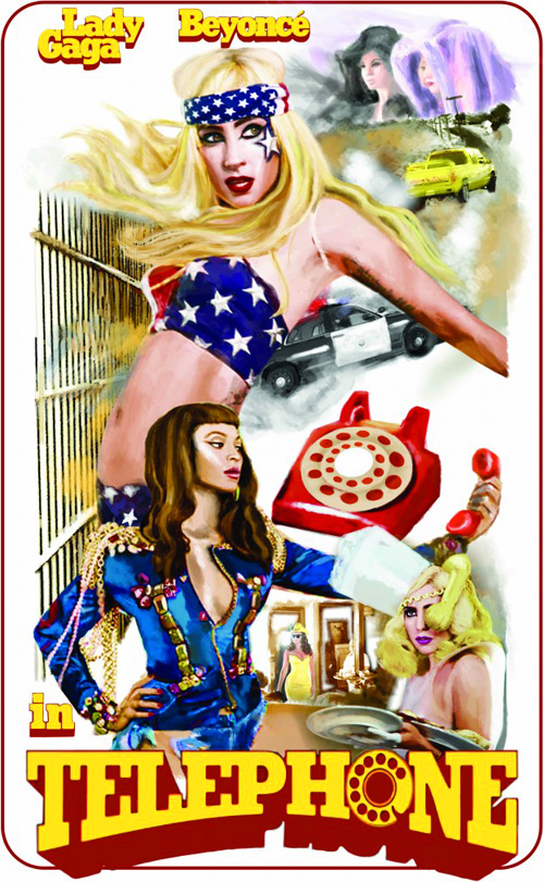 Although not completely the same, this poster and C.D cover for Lady Gaga and Beyoncé’s Telephone follow a very similar branding style. I feel that both of these products are created in a retro style, which easily links them together as few artists follow this unique approach. This retro impression is created firstly through the layout of each product, how the artist’s names are placed at the top of each, and the name of the song at the bottom. Although the font is different in each piece of material, both are very 1970’s with the large shadow and earthy colours. This shadow effect is also used behind the cut out images on the C.D cover, which gives the impression that this is computing at its best. However the poster is produced through a water colour painting of different scenes throughout the music video, I feel this creates the most retro vibe. The watercolour painting gives the impression that technology and computer animation was not an option when this song was produced, and that each individual poster is hand painted as it was created before use of photography. This retro/1970’s style creates the impression that the song ’Telephone’ will be a 1970’s disco/pop type song, as this was the genre of music which arose near the end of the 1970’s.
 Branding
Definition: The marketing practice of creating a name, symbol or design that identifies and differentiates a product from other products - http://www.entrepreneur.com
Brands work because they can offer us as an audience a form of guarantee. The use of Branding can turn a product into something unique and special, therefore making it stand out. Once Branding is successful with an audience, it can create other adverts that have nothing to do with the Brand, although people are still able to recognize the Brand.
Good examples of successful Branding are those such as Heinz and Cadbury's Chocolate.
Heinz was first established 140 years ago by a man named Henry J Heinz. Over the years he began to join forces with other business men in order to create and promote successful products. Heinz are very well known for their wholesome products, and consistency of good quality. Heinz are popular for more than one or two products and not just in the UK but all over the world, for example; Heinz is best known for it's Ketchup in the USA, Australia for it's Baby food and in the UK the obvious Beans. The most recent Branding Campaign for Heinz was that known as 'It Has to be Heinz', which was launched in October of 2009 across TV Stations, Radio, In-Store, Digital and PR.


 Branding is very important in marketing, as a certain image is portrayed about a product which is then portrayed upon its brand name. This special link from a product to its brand, and the characteristics the consumer expects of the brand, is why many people purchase one product/service instead of another. For example; due to the successful brand image of Coca Cola, consumers are more likely to purchase a can of Coca Cola than a Tesco Cola, even if it is a much higher price, as Coca Cola’s brand identity is linked to quality and a high standard.
From the results taken from the questionnaire, we can see that most people enjoy Marina and the Diamonds as an artist due to her uniqueness and quirky sense of personality. They express her as being an individual and different from the original stereotypical indie - pop artist, describing her music as upbeat and involving countless catchy tunes. However there was criticisms involved within this questionnaire from certain people quoting that they find her recent songs strange with no involving expression or creavity to her lyrics, and well as expressing that her style isn't suited to what they'd prefer. Also some participants didn't give an answer simply because they had no interest in her to listen to the music she produces.
The questions we created were also to see the interest gained from the participants about indie - pop, whether they like the genre and what they'd like to see from these type of music videos. They described that what they look for the most is a good narrative, a story line to keep the watcher engaged wanting to stay listening to the song rather than switching it over after so many seconds. They also commented that experimental videos and uniqueness to music videos is what they mainly enjoy not the usual expectations, something indivdual and different to keep them interested throughout. The male participants seem to want female dancers in their choice of music video mainly because it attracts them towards it and they can relate back to the song from the music video featuring them.
We also asked what they would associate with an indie - pop music video and their feedback was, bright colourful images, the band being shown simplicity, experimenting with different contents making the video unique and quirky also having the alternate representations as well as artists such as; The Script, Ellie Goulding and The Kooks associated with this genre.
We also lastly wanted to find out who their favourite artist was to give us an inside to what type of genre they listened to the most and whether an indie - pop music video would work for them. The results had a selection of Ellie Goulding, The Kooks, Libertines, Paramore, Lady Gaga. We had a good selection of indie - pop artists which has gave us a positive feedback for our video.
1. What type of genre do you listen to the most?
Indie- Pop
Dance
Soft Rock
Pop
Indie
R N B
2. Who's your favourite artist?
3. Do the artists music videos interest you?
4. What do look for in a music video?
5. What's your favourite music video?
6. What do you associate with an indie pop music video?
7. What artists do you associate with indie pop?
8. What age of people do you consider to listen to indie pop and what's your age?
9. What do you associate with Marina and the Diamonds?
10. Do you like this artist, if yes/no why?
Name: Grace
Age: 17
Music
Favourite Bands/Artists include; The Drums, Marina and the Diamonds, The xx.
Lifestyle
Enjoys: Attending gigs, researching new and upcoming bands, dedicated to yearly festivals,such as Leeds and Park Life Festival. Shopping in vintage shops as well as Topshop, Zara and H&M.
Appearance: Very slim, messy looking hair, festival wristbands worn. Lots of vintage looking jewellery,including many rings and necklaces.
Media
Television: Enjoys comedy that mostly appears on E4 such as, The Inbetweeners, Misfits and Scrubs. This is typically aimed at people of Grace's age as well as other channels such a BBC3 and Music Channels.
Other Technologies inlcuded in Grace's life range from her Ipod, mobile phone and laptop. Grace's Ipod is her main use of technology, taking it everywhere she goes and being a great priority. Her laptop is also greatly used in order to listen to the newest bands and to research new music, usually on websites such as Myspace, Spotify and Youtube. As well as this all of Grace's treausered songs are stored on her Laptop through iTunes.

I am going to analyse and explain in depth the contents of this video, the ideologies and representations given off as well as the special effects, lightening, mise en scene, cinematography and sound effects.
To draw attention to the audience a good start to a music video is an necessity, here in Ellie Gouldings - Starry Eyed close up shots of the singer are used for the audience to know who the artist is, whose representing the video. We have her contrasted into two to form a sort of symmetrical appearance of her creating an effect by also using shadows and dark lighting for special effects. White 'cartoon' stars are also used to create the effect of referring back to the title of the song being 'starry eyed' having the typical mise en scene to represent this, making it even more effective to the audience by placing them onto a black background for them then to disappear with the camera left to use mid angle shots to focus in on the main artist, as well them making an appearance a few points throughout this video, using special effects to give the image that the stars are coming out of the artists hands reflecting once again the title of the song.
This video includes lot of different techniques used for the special effects, as already mentioned we have the symertical view of her as well as the different darkness contrasted between the light to reflect the artist, and the typical white stars placed on the dark background to refer to the song. Also throughout the video, the artist is constantly being swapped to different angels changing positons and using a tracking technique to capture the moves and lyrics from her. We also have the bright lighting which is constantly used throughout this video showing the typical representations of 'stars' that they are bright, shiny and never dull, but as well as this contrasting it with dark colours to represent the night time setting where stars would usually appear.
Different locations are used throughout this video to make the production more interesting, keeping the audience attracted towards it the whole time, keeping their interests within the song. In this particular music video only two locations are used which aren't typical of the song, they seem to be placed within a historical house environment which personally i think is used to create a more unusual atmosphere, keeping the audience intrigued and using something different and unique rather than the stereo typical environments that would be used. The camera tends to use dissolve edits as well as straight cut edits to quickly transfer to a new location but always referring back to the original one, once again keeping the audience captured. We also have the dancers that are generally appearing in the video mostly throughout, having the special edits used on them to show how they transfer around the place featured, how they are dancing and creating a typical imagine of magical, exciting times, we get this connation as an audience through the title of the song being involved with stars, creating a more fantasy atmosphere.
The costumes that are used are generally the artist featured in small dresses and having the look of being bright, possibly reflecting the image of a star, as well sometimes wearing more darker coloured clothes such as blacks to create the night time image, making the representations of the song. The dancers often seen wearing light blue outfits, unusual outfits that stand out, making an appearance to the audience keeping them interested within the video as well as once again reflecting the night time.
To show that Ellie Goulding is the main artist featured in this video, close up shots are always used on her to create the image of her being the most important the whole video being about this one artist, and using long shots on the other dancers which are featured to represent that they aren't as important but still a feature involved within the video.
The song doesn't involve much creativity within its lyrics, but my thoughts are that this has been done on purpose so that the audience can appreciate this song basically for its catchy tune, and unique qualities.
In conclusion we can see that this particular music video focuses mainly upon editing making items seem unique and attracting the audience's attention keeping them engaged. We can see that various close up shots are used, focusing in on Ellie Goulding to show that she's the main artist (most important character). As well as this costumes featured show the contrasts between the light and dark.
As we now know that the genre for our music video is going to be Indie Pop, I have chosen to analysis Indie Pop/Rock group ‘Two Door Cinema Club - Undercover Martyn’. I will do this by following the Andrew Goodwin’s typical music video features whilst also looking at typical codes and conventions of the Indie Pop genre.
The first of Goodwin’s features is the clear link between lyrics and visuals. In this particular video there is little association between lyrics and visuals apart from the use of placards when they say the word ‘basement’ leading up to the chorus. This is probably because of the genre; Indie Pop can mostly be about the performance of the artist rather than a narrative in the video.
Another of Goodwin’s music video features is the relationship between the music and the visuals. I believe that in this video the visuals and the music have the biggest part to play throughout the whole of the video. The pace of the music changes repeatedly throughout from slow to fast, and so the visuals keep up with this through use of editing. For example; at the instrumental at the very beginning of the video, the band are moving and playing their guitars very fast and lively. Then as soon as the music alters and becomes slower they stop moving, this makes the audience ‘feel’ the music so to speak and understand the genre. Towards the end of the video, there is another instrumental part and the band is shown in UV lighting. The pace of this is very upbeat and the jump cuts between UV and normal lighting fit perfectly in time with the music, this fits in the with Indie Pop genre as it is experimental and lively. The images shown in the music video correlate to the music. When the music picks up and becomes more energetic the video becomes more animated with images of bright coloured ribbons, circles, balloons and the fact that they are being held up by people dressed in black becomes more apparent. The bright colours stand out from the black back ground making the video fun and individual which is was an Indie Pop video usually delivers to its audience.
The band in this video has managed to also create their individual star iconography through the video being more about the performance than a narrative. This is another of Goodwin’s music video factors. I think that they appear to be fun, energetic lively, down to earth people who enjoy their music. They also include a comedic element to their video which is typical of the Indie Pop video conventions, this is shown just by the fact that they are being held up and moved around by people dressed in black.
Aside from the Goodwin Model, the music video does include its own individual features, such as there is no narrative that links with the song it is purely the band portraying themselves as artists and performing their music. This is highlighted by the fact that they are playing their guitars throughout the video.
Through analysing this music video ‘Two Door Cinema Club - Undercover Martyn’ using Andrew Goodwin’s Model and typical conventions of the Indie Pop genre, I now have a clearer understanding as to what elements will be necessary in our music video. For example how editing matching the images can create entertainment for the audience, and how important it is to find the artist original style and use that to influence the making of the music video.


